Amazon Elasticsearch
- Record the output URLs of the resources are stored in the Simple Server Manager (SSM) Parameter store, go to the region for SSM parameter store where you’ve launched the stack.
- Kibana URL (KibanaUrl) where you can open up the dashboard,
- URL to create a user from the created Amazon Cognito User Pool (UserCreationUrl)
- Cloudfront URL you must whitelist in the Amazon Connect application whitelisting setting.
Testing the deployment
- Make an outbound call from the Cloudfront URL, after 30 seconds you should start to see metrics flowing into Elastic Search/Kibana/Splunk
Amazon Elasticsearch
- There are three dashboards that gets deployed
- “Business user - queue based dashboard”
- “Technical user - queue based”
- “Drill down dashboard”.
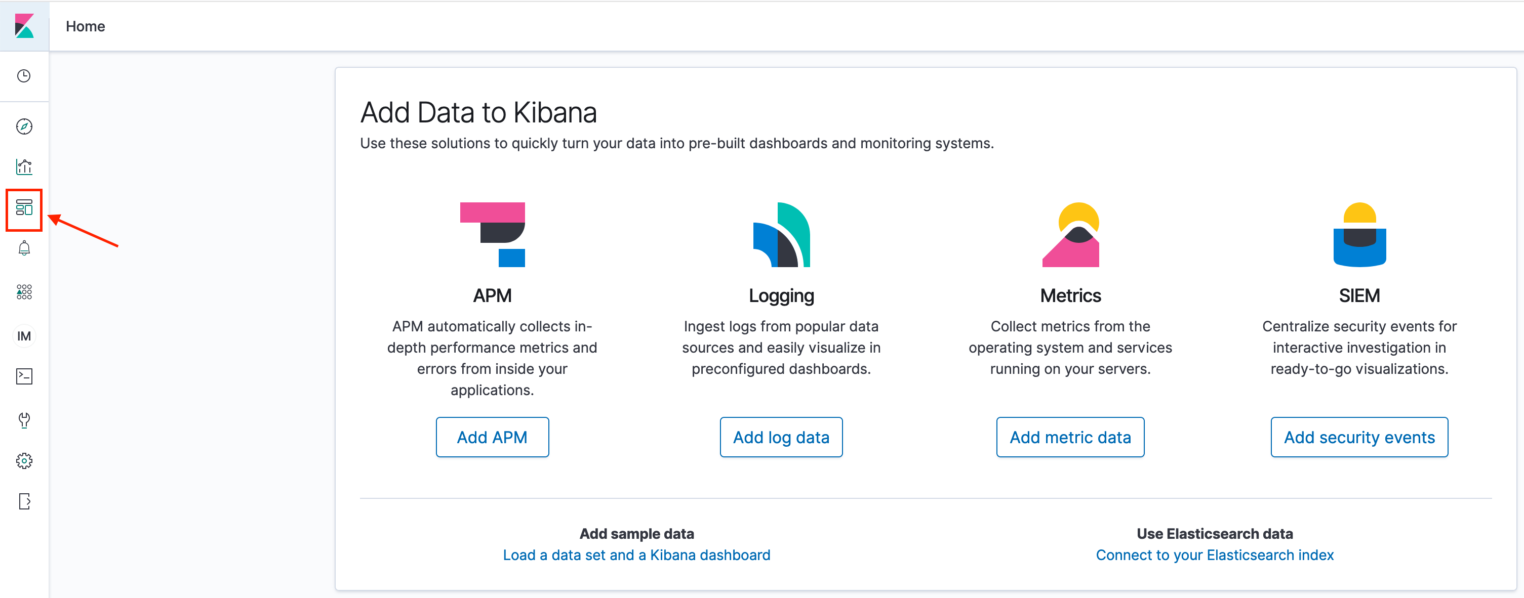
They can be found under dashboards in Kibana. Screenshot below shows where to find dashboards inside Kibana.
- Click open the business user dashboard and the technical dashboard, you should be able to see the metrics.
Kibana Dashboards
Using the dashboards
Amazon Elasticsearch
Business user - Queue based dashboard
This dashboard displays some business metrics. The calls are grouped by the queue where the calls were placed into. In the dashboard you can see two visualisations.
- “softphonestreamstats”
- “call report”
They match with the indexes which exist in ElasticSearch, for more information on the detailed data model please refer to the data model documentation.
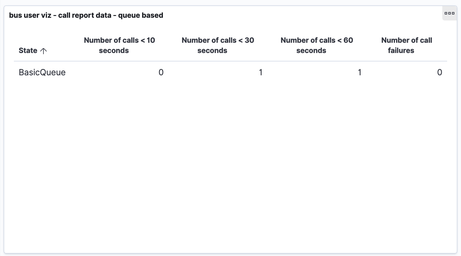
Softphone call report visualization
Business dashboard
This screenshot on the left hand side of the dashboard shows a few metrics that are based from the data model in the “softphoencallreport-*” index. The metrics displayed here are:
- Number of calls less than 10 seconds
- Number of calls less than 30 seconds
- Number of calls less than 60 seconds
- Number of call failures
These metrics are grouped by the queue the contact was in.
These metrics are the default values for this visualization, however, you can customize this dashboard to show any of the metrics in the “softphoencallreport-*” index data model. For more details about Kibana visualizations please refer to Kibana documentation here.
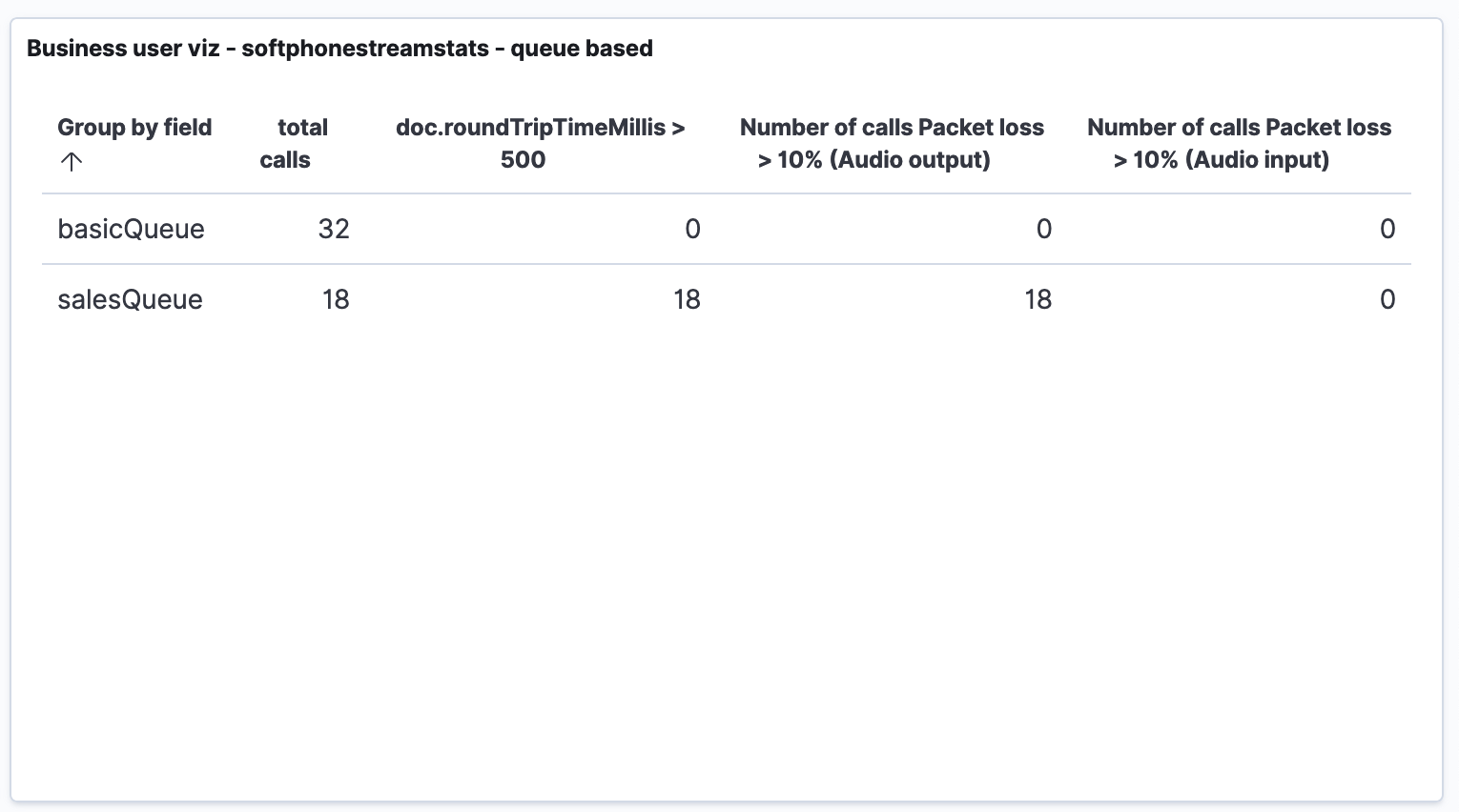
Softphone stream stats visualization
Business dashboard 2
This screenshot on the right hand side of the dashboard shows a few metrics that are based from the data model in the “softphonestreamstats-*” index. The metrics displayed here are:
- Number of total calls
- Number of calls where round trip time where greater than 500 milliseconds
- Number of calls where packet loss for output audio is greater than 10%
- Number of call where packet loss for input audio is greater than 10%
These metrics are grouped by the queue the contact was in.
These metrics are the default values for this visualization, however, you can customize this dashboard to show any of the metrics in the “softphonestreamstats-*” index data model.
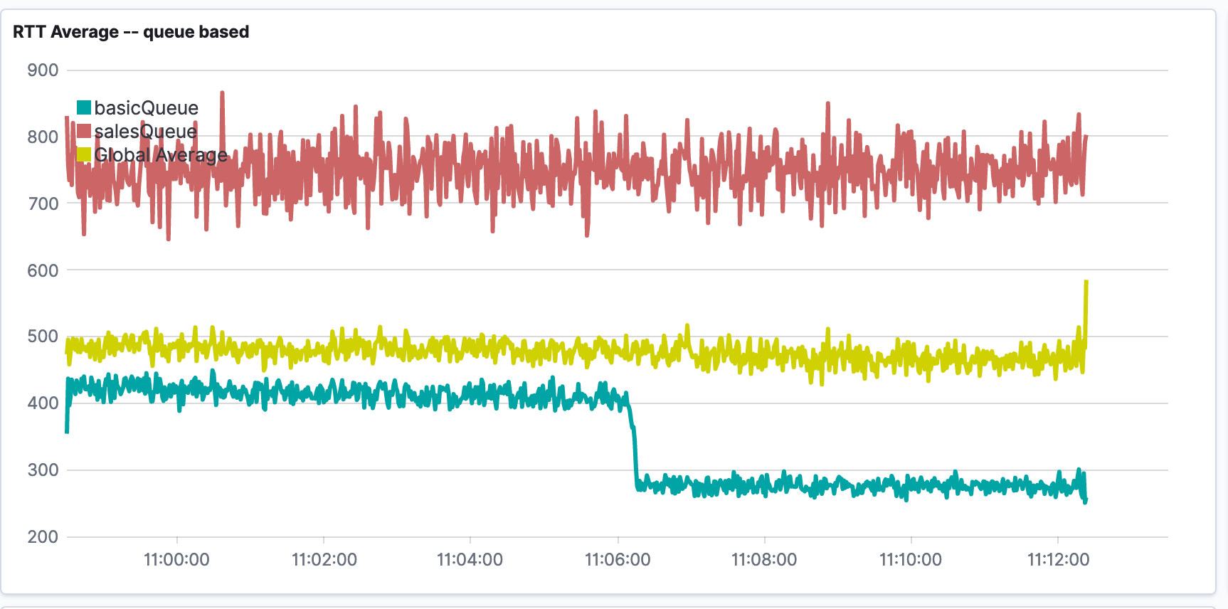
Technical user - Queue based dashboard
Tech dashboard
This dashboard consist of three visualizations, Round Trip Time average, Jitter Buffer Average, and Packet Loss Average. The dashboards by default will visualise the seperate queues in your index in different lines. By default these metrics are grouped by the queue of the contact, however, this can be customised to another field by editing the visualization.
For example in the screenshot below we can see the round trip time average for the basicQueue is hovering from 400 milliseconds and then drops to around 300 milliseconds. However, we can see the salesQueue is consistently having round trip time between 700 and 800 milliseconds.
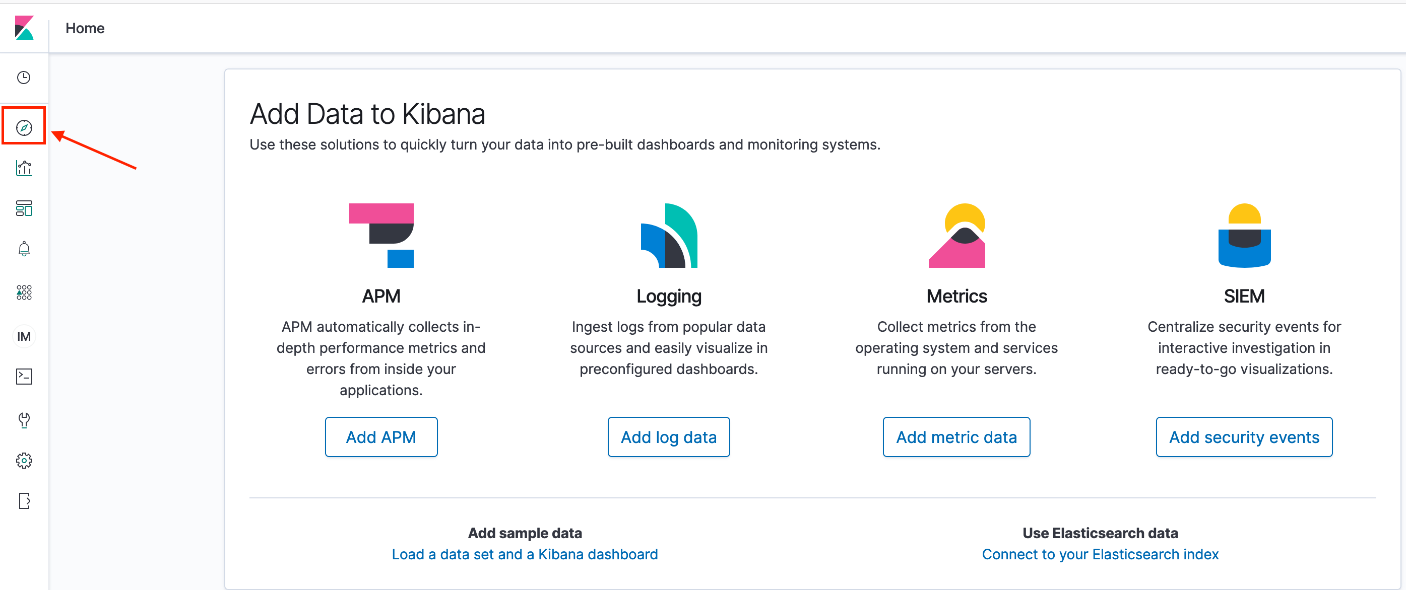
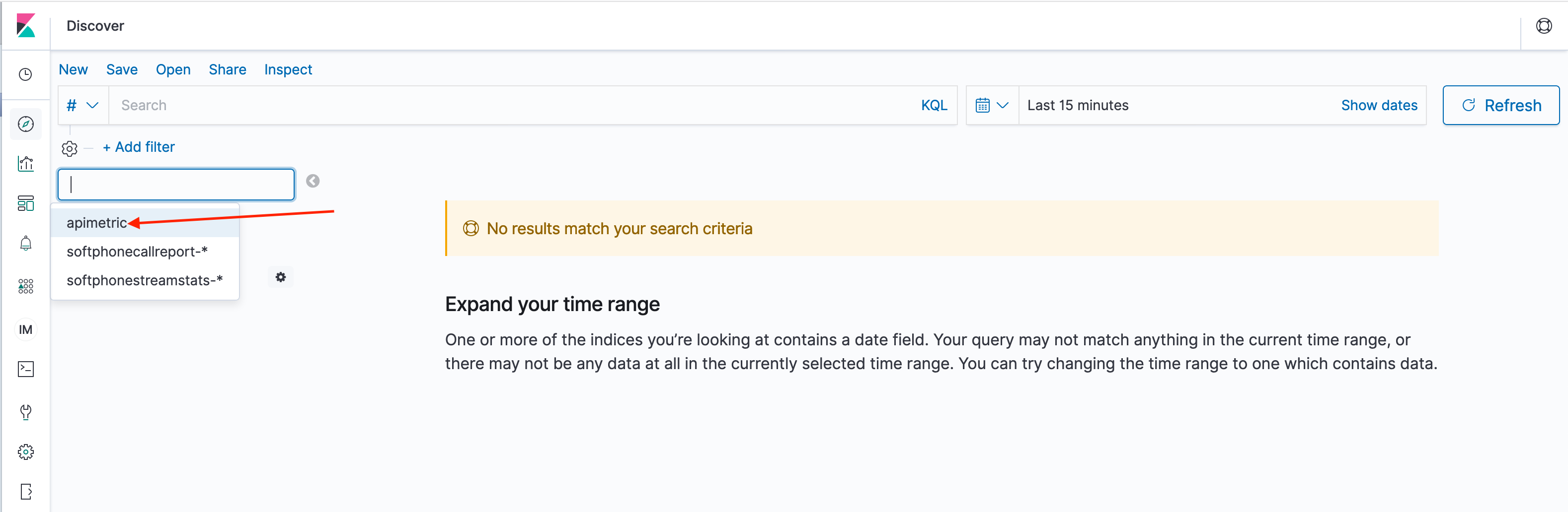
Discover tab
Once you have identified an area that requires a deeper dive, for example the large round trip time values for the salesQueue from the visualization in the technical dashboard screenshot above, you can click the discover tab in Kibana to investigate the raw data from that index.
The screenshot below shows you how to navigate to the discover tab.
Discover dashboard 1
Discover dashboard 2
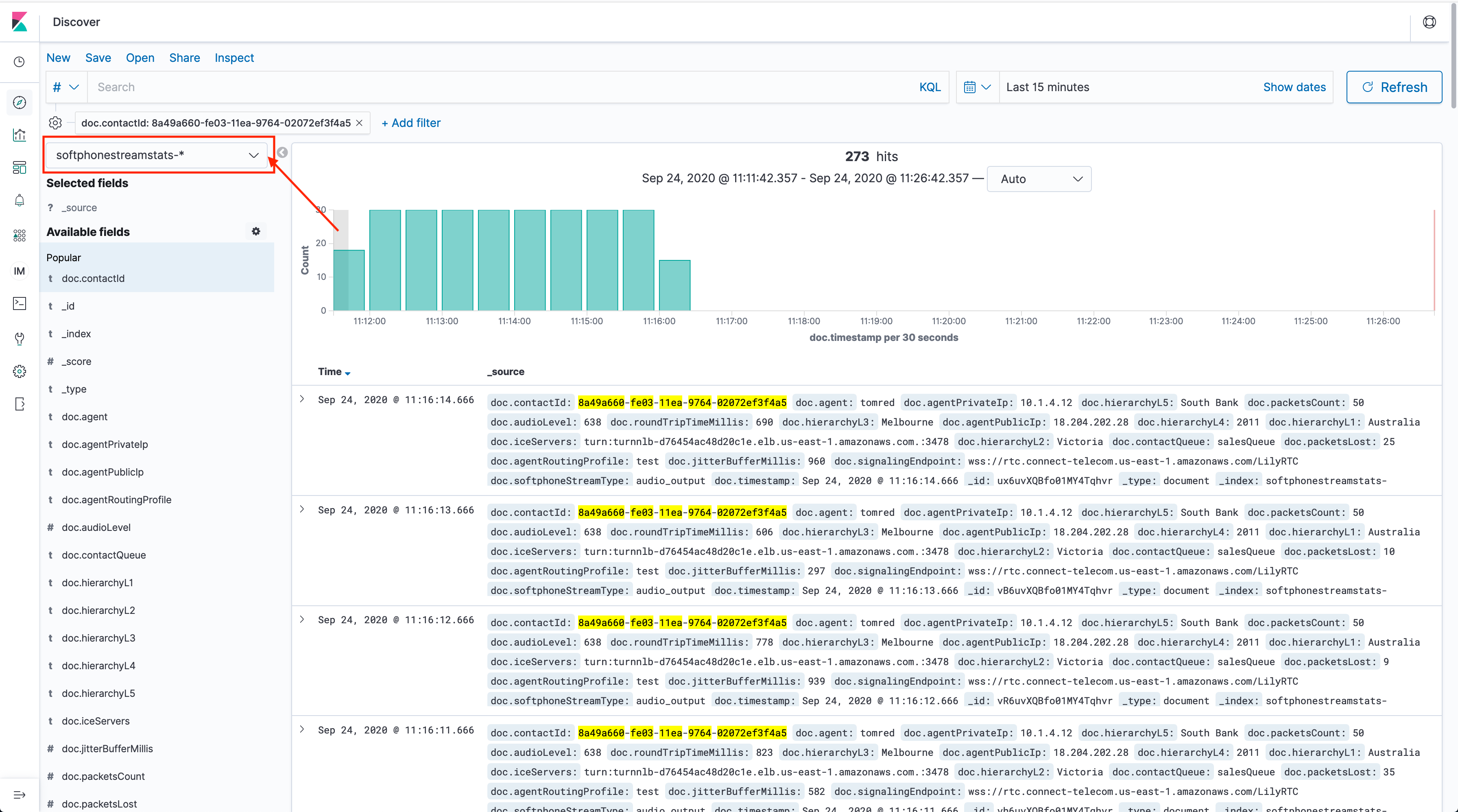
Discover dashboard 3
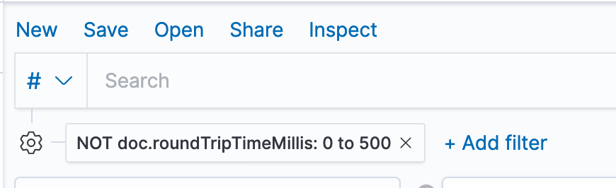
There are other filters one can use in Kibana, such as filtering for records in the index where the roundtrip time was above 500 (the language in the query langauge requries us to say, Not between 0 to 500, which means above 500.
Discover dashboard 4
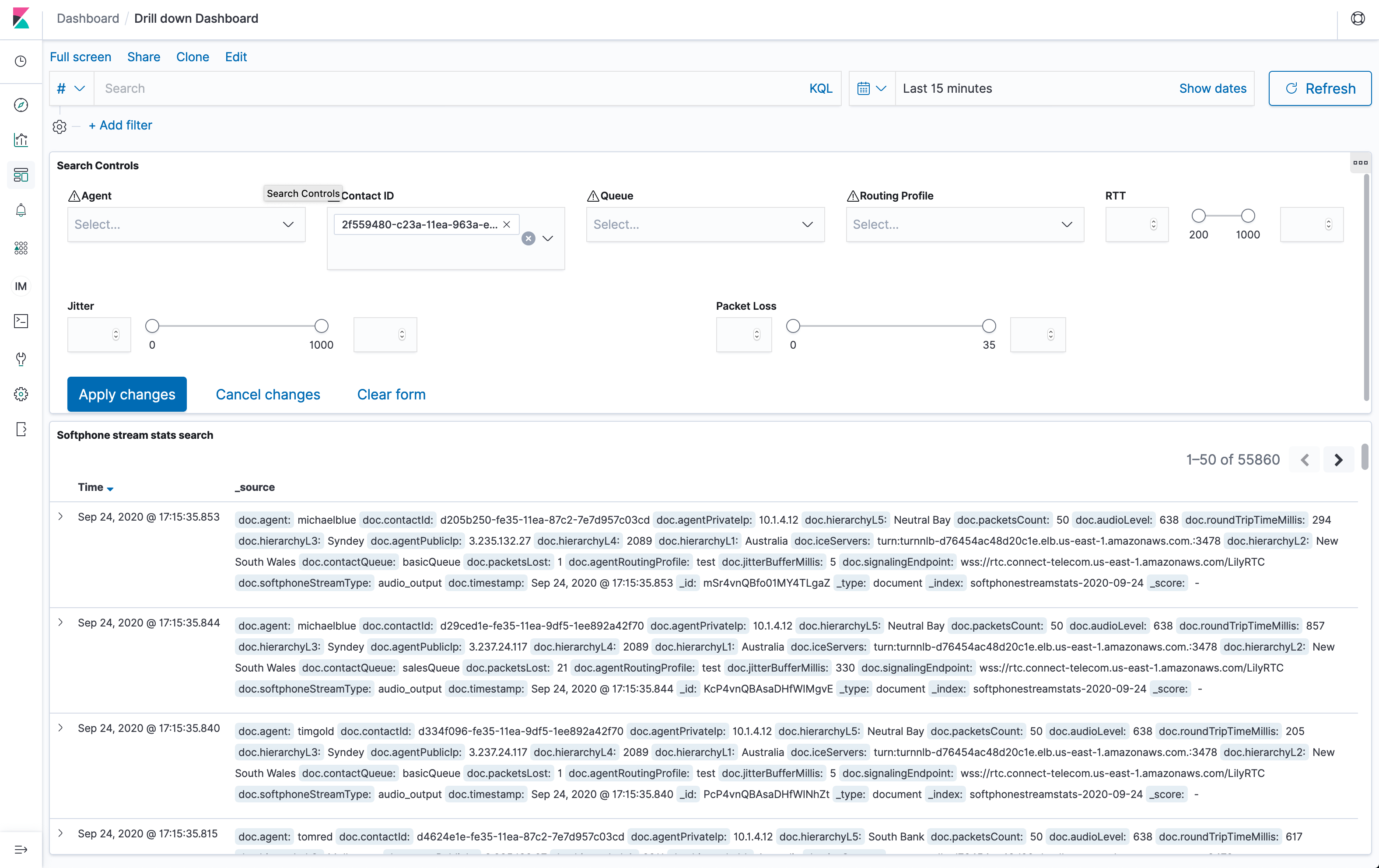
Drill down dashboard
To make the filter and investigation easier, we’ve built another dashboard call the “drilled down dashboard”. Here you can filter based on a few of the key attributes. For example if you were troubleshooting the long round trip times from the salesQueue you could filter by the Queue attribute and see all the records in the salesQueue. You can then apply another filter for RTT (round trip time) to filter for all the records greater than 500 RTT.
Once the records have been filtered you can investigate the records to see if there are any patterns. For a detailed list of data model for these records please refer to the data model documentation.
Another useful way of using the drill down dashboard is when a particular agent is reporting poor audio quality, you can filter by the agent and look at all the records from the agent and troubleshoot using the data provided in the record.
Drill down dashboard 4